
Section 1.1 The Trend Over Time
Objectives
Use correlation coefficients to discuss the strength of an association between two quantities in a data set.
Given a set of two-variable data, generate a scatter plot of their association using Excel, using choices of scales, labels, and titling that highlight its salient features.
Use Excel to determine a regression equations for the best-fit linear function associated with a two-variable data set, and contextualize the meanings of its parameters, with units.
Worksheet 1.1.1 Decision Report 1: What's My Lane?
The first step in this project is to find a market opportunity. To do that, you'll find historical data on a quantity of interest to you, and a second quantity that's both (a) highly correlated with yours, and (b) that you -- and your competitors -- wouldn't expect to be correlated with yours!
You'll design a fictitious product or service around the first quantity, and then a marketing plan around the second quantity. Using an algebraic model of their correlation, you'll predict where both will be in five years, to estimate the size of the market for your product and a marketing budget.
1.
Visit the Spurious Correlations website at https://tylervigen.com/discover and browse the list of available categories of “Interesting Variables”. Select View variables to see the data sets available in each category.
Find a variable that you'd like to design a product or service around. For example, if I select “Precipitation in Plymouth County, MA”, I might decide to market a Plymouth Rock-shaped rain meter with wireless smart-home integration. Your product or service should be one whose demand will increase when your variable increases. (More precipitation in Plymouth County means I'll sell more Plymouth Rock rain meters.)
Describe the variable you selected, and the product/service you would market to match it. You'll put some of this information in your business plan, so be creative. Spark your readers' interest and excitement!
2.
With your variable shown on the website, select Correlate to discover other variables that are correlated with yours. You'll see that each option shows two things: how many years' worth of data has been correlated, and the correlation coefficient, of each variable's correlation to yours.
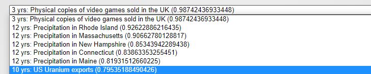
Find a variable in this list for which all of the following are true:
At least 6 years' of data are included in the correlation,
The variable is seemingly unrelated to your other variable of interest, and
The correlation coefficient is as high as possible, given the above two criteria.
For example, here I'm selecting “US Uranium Exports” because it has 10 years of data to correlate, uranium exports seem totally unrelated to precipitation in Plymouth County (unlike the other precipitation-related variables in this list), and the correlation coefficient \(\approx 0.795\) is the highest among variables in my list that meet the previous two criteria.
Describe the variable you selected, and why it meets all of the criteria necessary for this step.
3.
With your selected variable shown on the website, click Chart.
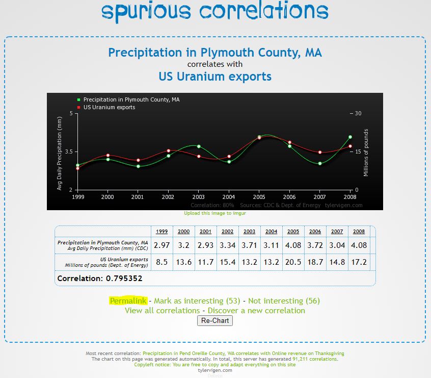
Then, open a blank Excel workbook and enter the data shown in the page, including the years and both data series. You'll want to subtract 2000 to rescale the years to be “Years since 2000”, for simplicity in your algebra later.
t   Years since 2000    -1      0       1       2       3       4       5       6       7       8
x   Precipitation       2.97    3.2     2.93    3.34    3.71    3.11    4.08    3.72    3.04    4.08
y   Uranium exports     8.5     13.6    11.7    15.4    13.2    13.2    20.5    18.7    14.8    17.2
4.
Use Excel to generate a scatter plot of your two variables \(x\) and \(y\) (you will not use the “years” data in this plot). Plot only the points; do not connect them lines or curves.
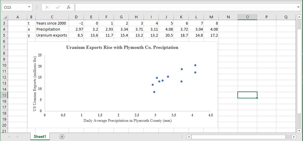
Make sure that your graph includes a title, axis labels, and a scale that makes the range of data points visible. The FlowingData blog has some good tips and explanations for creating graphs that are meaningful.
5.
Finally, use Excel to add a linear trendline to this scatter plot, and display its formula and correlation coefficient on your chart.
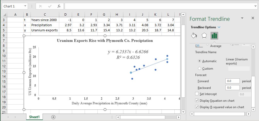
In 1-2 sentences each, explain the meaning of the numbers in (a) the slope parameter and (b) the intercept parameter from your linear model equation, including units, but using language that a less-technical audience would understand. For example:
The slope of this equation is 6.2337 million pounds per mm. This number tells us
that an increase of 1 mm in average daily precipitation in Plymouth County
is associated with an increase of approximately 6 million pounds of uranium
exported by the United States in that year.
6.
Turn your responses to all the previous questions into a single writeup of this activity. Your writeup should be a maximum of one page, single-spaced, not including any graphs or tables, and should not include question numbers: your readers should be able to understand your paper without seeing this worksheet of questions.